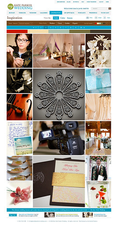
The my KPW team is getting so excited about the design of the new website and thought it would be fun to share with you a glimpse of how the inspiration page is turning out. There's a little left to be done (and a few improvements), though we can't hold back anymore!
Here's a great example of the inspiration page layout:
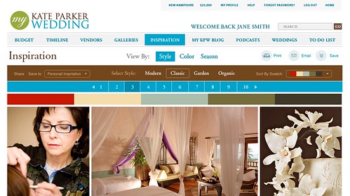
And here's a slightly closer view of the page:
On a daily basis, the my KPW editorial staff will select a handful of images fitting to a particular style, color, or season to create a fresh inspirational display. Each photograph is live, so brides can easily identify the vendor(s) behind the photo. And what we love about the photos are their sizes! We love that they are so large, because typically with other inspiration boards, the photographs are small so it's really hard to view all of the details.
As shown in the top toolbar, each inspiration can be viewed by style, color, or season. Once an inspiration displays on the screen, the corresponding color swatch will display above the images. A bride can also go to the drop down menu in the upper righthand corner to select alternate swatches.
Subscribe to:
Post Comments (Atom)


No comments:
Post a Comment